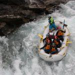
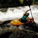
Some of the styles for this blog, for standard elements like headings and blockquotes, more obscure elements like citations and some that you’ll have to delve a little into the HTML (text rather than visual editor) to get, like full width images.
If you’re looking for advice on Palm’s preferred spellings, we have a list of common words, or if your looking for general advice about writing style, we have a style guide for writers (short and simple, plain English). If something isn’t covered in the style guide and you’re still unsure, then we usually defer to UK English, the Oxford Style Manual (R M Ritter) or please comment on, to add to our style guide.
Heading 1
This one is reserved for your post titles, at the top of the page, don’t use an H1 in your posts.
Heading 2
This one is the largest, top level size to use in your posts.
Heading 3
Try not to use more than two levels of heading, but you may find these smaller sizes useful.
Heading 4
This one is full caps, so we have an alternative, which might be useful.
Heading 5
This one is actually the same size as the body text, except the font weight is lighter.
| Firstname | Lastname | Age |
|---|---|---|
| Jill | Smith | 50 |
| Eve | Jackson | 94 |
Looks like tables aren’t styled at all … will leave them for now unstyled and add later if anyone needs to use a table. It also looks like there’s no padding after this table so here’s a paragraph of text and a horizontal rule element.

Wind over swell at Ramsey Sound, makes the wave great for nimble sea kayaks
That was a full width image, you can make any single image you insert in a post to be full width, by looking in the ‘Text’ tab of your editor (top right) to edit the HTML of the post. Alter the class of the tag to class=”img-full-screen”. This class can be used for any block level element (not just images), we have used it on <iframe> and <div> elements to make the content inside fit across the width of the screen.
I’d like to add a caption to my image, where do I do that?
To add a caption under an image, like the one above, you can either type your caption in the box when you upload and insert your image – or after you have placed the image, click on it to see some alignment options and an edit symbol (pencil). This edit symbol will let you add a caption to your image after you have already placed it in your post/
- Wood Hole, Raundalselvi
- Kaituna play hole
- Mystic Kaituna
And that’s a tiled gallery. You can add one to your post with the ‘Add Media’ box top right in the editor. Create and name a gallery from images you have already uploaded, or upload a new set, then name your gallery and insert it. The default look for a gallery like this is tiled and each of the images open in a lightbox if you click on them. Add a caption to each image and it will appear on rollover (mouse) or first tap (mobile).
Embedding videos from YouTube it’s a good thing to include ?rel=0 at the end of your Youtube link to make the embed, since that turns off the related video suggestions you see at the end of your video. Another good way to prevent Youtube’s video suggestions from popping up at the end, is to embed a playlist, so at the end you see the rest of the videos in your playlist.
If you’re adding music to your video, copyright music will be automatically detected by Vimeo and YouTube. YouTube will put adverts over your video if it detects unlicensed music, so whenever you can, use Creative Commons music, out of copyright recordings or cheap royalty free tracks (such as you might find in Vimeo and YouTube’s own music store). Always credit the musician in the video description. Here’s a description of how to credit works under Creative Commons, the shorter, ‘pretty good’ credit is usually the one to go for.
If you’ve got a punchy quote that you want to stand out, then use a blockquote.
this blockquote was said by Timothy
Particularly useful for top tips and ‘listifying’ posts, we can use Font Awesome dingbats in blog posts to layer text elements and, for example, put a number in a circle.
1
The first of three things
With this heading I can go on to explain what my favourite thing is in my ‘listifying’ post, or ‘one of the five strange things you should avoid’, or that ‘number three will astound you’, or better still, like one of Erin’s posts, use it to number the headings below to match locations on a Google map you’ve included about a journey around an island.
2
The second of three things
With this heading I can go on to explain what my second favourite thing is in my ‘listifying’ post, or ‘one of the five strange things you should avoid’.
3
The third of three things
With this heading I can go on to explain what my third favourite thing is in my ‘listifying’ post, or ‘one of the five strange things you should avoid’.
And there’s the full width map we told you about, using the “img-full-screen” class again, but this time applied to the regular old iframe that Google maps give you to embed. If you have made a map for your post, share it with us with privileges to edit and we will make a copy onto our Google Apps space so that we can preserve your map on the Palm blog for ever and ever.


